Quantic Sci
A typeface family for scientific reports, derived from Fraunces. This website is set in it.
This page is set in Quantic Sci, from the body text to the headings. It is a typeface family, a complete set of letters, that I made for scientific reports from Fraunces, a free typeface.
An academic report in LaTeX needs one face for the text, another for the headings and formulas that do not clash with either. Quantic Sci puts the personality in the body and the headings and leaves the formulas to Libertinus Math, so they stay sober and sharp.
Five styles out of a variable font
Fraunces has a variable version, with axes that change the weight and shape of the letters. From those axes I took five fixed styles, namely regular, italic, bold, bold italic and a Display cut for headings, and gave them the identity of a family of their own.
I did not draw it from scratch, and that is worth saying early. It is a derivative of Fraunces with changes made in code.
A layer of signature glyphs
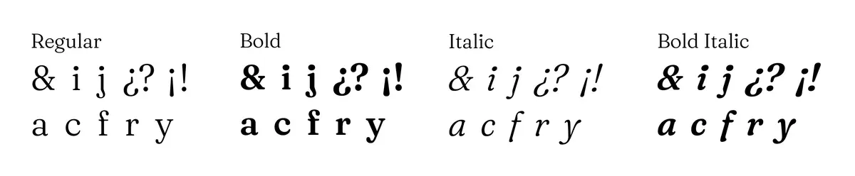
On the four text styles I applied, in code, a layer of signature glyphs. The dot on the i and the j grows and rounds off, the sharpest corners of a, c, f, r and y are softened, the ampersand comes from EB Garamond and the question and exclamation marks gain a little size.
I also prepared a LaTeX template that puts it to work alongside Libertinus Math.
It is free, like Fraunces and EB Garamond, and anyone can use, modify and redistribute it. The one thing a modified version does not get to keep is the name.